Shinterface is a humorous and critical term combining “shit” and “interface”, referring to poorly designed user interfaces (UI) that frustrate users due to bad design choices by software developers.
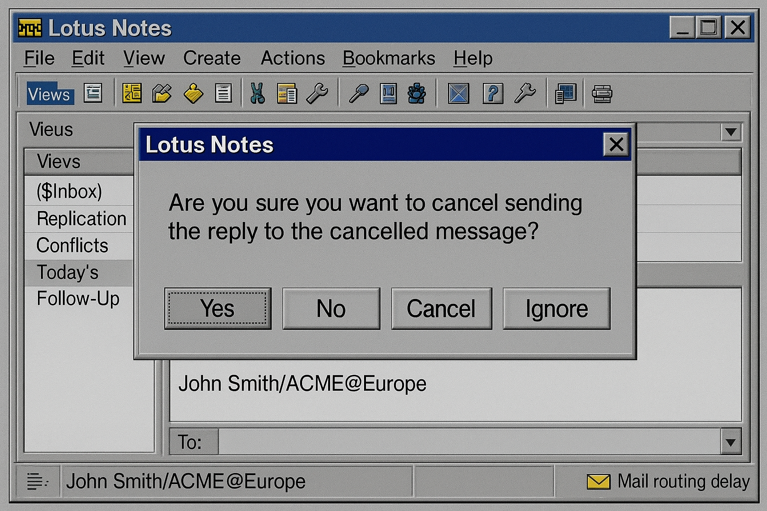
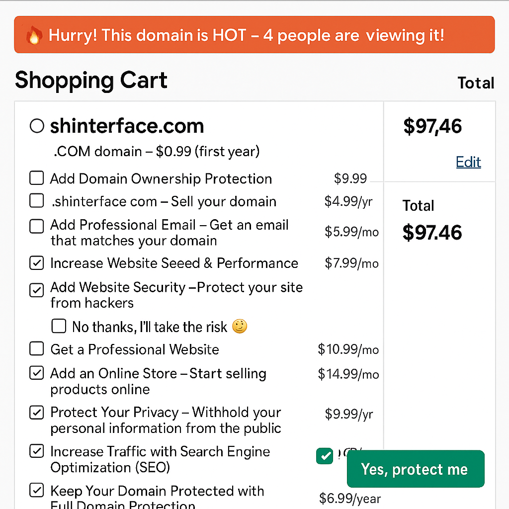
Shinterface is a humorous and critical term combining “shit” and “interface”, referring to poorly designed user interfaces (UI) that frustrate users due to bad design choices by software developers.