

Je ne parle pas Nespresso
Language switching made Difficult
One of the most pointless UX decisions I keep running into is websites that offer a language switcher… but list all the languages in the current language.
If I’m viewing a site in English and looking for, say, 日本語 or العربية or Español, why on earth would the dropdown show me “Japanese,” “Arabic,” and “Spanish” instead? If someone can’t read English, how are they supposed to find their own language in a sea of English words?
Enter Nespresso.
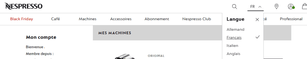
Of course I know that Allemand is German and Anglais is English (Italien is guessable) but why list them in the current UI language??
It defeats the entire purpose of having a language selector.
A language switcher should be the easiest thing in the world to use:
List each language in its own native name — Deutsch, Français, Português, 한국어 — so anyone can find their language instantly, even if they don’t understand the language the site is currently using.
It’s such a small change, but it makes a massive difference for accessibility, usability, and basic respect for multilingual users. Nespresso: do better.